
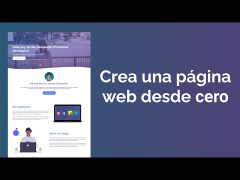
Hay fantasmas en la arquitectura web. Sistemas modulares, frameworks que prometen la luna, y al final, siempre acabas luchando contra la abstracción. Hoy, vamos a despojarnos de todo eso. Vamos a construir una página web desde los cimientos, con las herramientas más puras: HTML y CSS. Un ejercicio de minimalismo técnico que te recordará quién manda realmente: tú y tu código.
Olvídate de Bootstrap, de Tailwind, de cualquier otra capa de abstracción. Vamos a dominar Flexbox y CSS Grid, los caballos de batalla modernos del diseño responsivo, sin necesidad de librerías externas. Prepárate para entender la anatomía de una página web, capa por capa. Esto no es solo un tutorial; es un ritual de iniciación para cualquiera que quiera pensar como un ingeniero de sistemas, no como un mero ensamblador de componentes.
Tabla de Contenidos
- Introducción Cínica: La Arquitectura desnuda
- Laboratorio Virtual: Herramientas Esenciales
- HTML: El Esqueleto Digital
- CSS: La Piel y los Nervios
- Flexbox: La Danza Unidimensional del Layout
- CSS Grid: El Tablero de Ajedrez Responsivo
- Adaptación Extrema: El Arte de la Responsividad
- Veredicto del Ingeniero: ¿Por qué CSS Puro?
- Arsenal del Operador/Analista
- Taller Práctico: Primeros Pasos
- Preguntas Frecuentes
- El Contrato: Tu Primer Cliente Digital
Introducción Cínica: La Arquitectura desnuda
En este submundo digital, la tentación de usar frameworks es como un atajo en una zona de guerra: rápido, pero peligroso. Te dan las herramientas, sí, pero a costa de tu entendimiento profundo. Hoy, te propongo un detox. Vamos a desarmar la maquinaria, a entender cómo cada pieza encaja sin recurrir a muletas. Veremos cómo HTML provee la estructura básica, el esqueleto de nuestra presencia en la red, y cómo CSS, con su elegancia matemática, le da forma, le añade carácter, y sobre todo, lo hace inteligente al adaptarse a cualquier pantalla.
Piensa en ello como la diferencia entre usar un robot preprogramado y pilotar tu propia nave espacial. Sí, el robot llega, pero tú entiendes cada propulsor. Aquí, el objetivo es que entiendas cada selector, cada propiedad, cada regla. Que seas capaz de diagnosticar un problema de layout o de optimizar el rendimiento porque conoces la arquitectura interna, no porque recuerdas la sintaxis de una librería.
Laboratorio Virtual: Herramientas Esenciales
Antes de adentrarnos en la construcción, necesitamos nuestro espacio de trabajo. No hace falta un superordenador, solo las herramientas adecuadas para no sentirnos atados.
- Editor de Código: Olvida los editores de texto planos. Necesitas algo que entienda el código. Recomiendo Visual Studio Code (VS Code) por su potencia, extensibilidad y, sí, es gratuito. Alternativas como Sublime Text o Atom también cumplen la misión.
- Navegador Web: Tu lienzo. Firefox y Chrome son tus aliados por sus excelentes herramientas de desarrollador integradas. Apréndete a usar la consola y el inspector de elementos. Son tus ojos en el código.
- Archivo HTML: `index.html` será el punto de entrada, la espina dorsal de todo.
- Archivo CSS: `style.css` (o el nombre que prefieras) contendrá toda la magia visual.
La clave es la simplicidad. Cada herramienta debe servir a un propósito claro, sin distracciones. Como un buen francotirador, cada elemento de tu arsenal debe ser eficiente y directo.
HTML: El Esqueleto Digital
HTML (HyperText Markup Language) es la columna vertebral. Define la estructura y el contenido semántico de tu página. No es para el diseño; es para la organización. Un buen HTML es legible para humanos y máquinas.
Empezamos con lo básico. Un `index.html` bien estructurado se ve así:
<!DOCTYPE html>
<html lang="es">
<head>
    <meta charset="UTF-8">
    <meta name="viewport" content="width=device-width, initial-scale=1.0">
    <title>Mi Página Web Desde Cero</title>
    <link rel="stylesheet" href="style.css">
</head>
<body>

    <header>
        <h1>Bienvenido a mi Portafolio</h1>
        <nav>
            <ul>
                <li><a href="#sobre-mi">Sobre Mí</a></li>
                <li><a href="#proyectos">Proyectos</a></li>
                <li><a href="#contacto">Contacto</a></li>
            </ul>
        </nav>
    </header>

    <main>
        <section id="sobre-mi">
            <h2>Sobre Mí</h2>
            <p>Soy un desarrollador apasionado por la creación de experiencias web limpias y funcionales.</p>
            <!-- Podría ir una imagen aquí -->
        </section>

        <section id="proyectos">
            <h2>Mis Proyectos</h2>
            <!-- Aquí se listarán los proyectos -->
        </section>
    </main>

    <footer>
        <p>© 2024 Mi Nombre. Todos los derechos reservados.</p>
    </footer>

</body>
</html>
Observa la semántica: `header`, `nav`, `main`, `section`, `footer`. Cada etiqueta tiene un propósito. El `lang="es"` indica el idioma, y el `viewport` es crucial para la responsividad. El enlace a `style.css` es la conexión vital con el estilo.
CSS: La Piel y los Nervios
CSS (Cascading Style Sheets) da vida a ese esqueleto. Controla la presentación: colores, fuentes, espaciado, posicionamiento. Es donde la estética se encuentra con la funcionalidad.
Nuestro `style.css` comenzará con reglas generales:
/* Estilos Generales y Reset Básico */
- {
margin: 0;
padding: 0;
box-sizing: border-box; /* ¡Fundamental para un layout predecible! */
}
body {
font-family: 'Segoe UI', Tahoma, Geneva, Verdana, sans-serif;
line-height: 1.6;
color: #333;
background-color: #f4f4f4;
}
h1, h2, h3 {
color: #0056b3; /* Un toque de autoridad */
margin-bottom: 1rem;
}
a {
color: #007bff;
text-decoration: none;
}
a:hover {
text-decoration: underline;
}
header {
background: #333;
color: #fff;
padding: 1rem 0;
text-align: center;
}
header nav ul {
list-style: none;
padding: 1rem 0;
}
header nav ul li {
display: inline;
margin: 0 15px;
}
main {
padding: 20px;
max-width: 960px; /* Ancho máximo para contenido principal */
margin: 20px auto; /* Centrado */
background: #fff;
box-shadow: 0 0 10px rgba(0,0,0,0.1);
}
section {
margin-bottom: 20px;
}
footer {
text-align: center;
padding: 1rem 0;
margin-top: 20px;
background: #333;
color: #fff;
}
El selector universal `*` con `box-sizing: border-box;` es un cambio de juego. Evita sorpresas con el padding y los bordes que alteran las dimensiones calculadas. Definimos una fuente legible y un esquema de colores básico. Los estilos para `header`, `main` y `footer` empiezan a darle forma a la estructura HTML.
Flexbox: La Danza Unidimensional del Layout
Flexbox es ideal para alinear elementos en una sola dimensión, ya sea horizontal o vertical. Piensa en menús de navegación, listas de elementos en una tarjeta, o la distribución de contenido dentro de una barra lateral.
Vamos a aplicar Flexbox a la navegación dentro del `header`:
/* --- Flexbox para Navegación --- */
header nav ul {
    display: flex; /* Activa Flexbox */
    justify-content: center; /* Centra los ítems horizontalmente */
    align-items: center; /* Centra los ítems verticalmente si tuvieran alturas diferentes */
    list-style: none;
    padding: 1rem 0;
}

header nav ul li {
    margin: 0 15px; /* Espaciado entre ítems */
}

/* Resto de estilos de header */
Simplemente al añadir `display: flex;` al contenedor `ul`, convertimos sus hijos (`li`) en ítems flexibles. `justify-content: center;` los alinea al centro del eje principal (horizontal por defecto). Es magia pura, sin artificios. Para la lista de proyectos, podríamos usar Flexbox para disponer cada proyecto en una tarjeta:
/* --- Flexbox para Cards de Proyectos --- */
#proyectos {
    display: flex;
    flex-wrap: wrap; /* Permite que los ítems pasen a la siguiente línea */
    gap: 20px; /* Espacio entre las cards */
    justify-content: center;
}

.proyecto-card {
    flex: 1 1 300px; /* Flex-grow, flex-shrink, flex-basis */
    background: #e9ecef;
    border: 1px solid #ccc;
    border-radius: 5px;
    padding: 15px;
    box-shadow: 2px 2px 5px rgba(0,0,0,0.1);
    text-align: center;
    max-width: 300px; /* Ancho máximo de la card */
}

.proyecto-card h3 {
    margin-bottom: 10px;
    color: #0056b3;
}
Y en el HTML, tendríamos:
<section id="proyectos">
    <h2>Mis Proyectos</h2>
    <div class="proyecto-card">
        <h3>Proyecto Alpha</h3>
        <p>Descripción breve del proyecto.</p>
    </div>
    <div class="proyecto-card">
        <h3>Proyecto Beta</h3>
        <p>Descripción breve del proyecto.</p>
    </div>
    <!-- Más tarjetas si es necesario -->
</section>
Con `flex: 1 1 300px;`, cada tarjeta intentará tener al menos 300px, podrá crecer si hay espacio (`flex-grow: 1`) y podrá encogerse si no lo hay (`flex-shrink: 1`). `flex-wrap: wrap` es la clave para que se apilen responsivamente.
CSS Grid: El Tablero de Ajedrez Responsivo
Si Flexbox es para una dimensión, CSS Grid es para dos. Es perfecto para el layout general de la página: organizar secciones, columnas, y elementos complejos en una cuadrícula.
Apliquemos Grid al contenedor principal `main` para organizar las secciones `section` que contienen el contenido:
/* --- CSS Grid para el Layout Principal --- */
main {
    display: grid;
    /* Define dos columnas: la primera ocupa 1/3, la segunda 2/3 */
    /* Esto es solo un ejemplo; la responsividad ajustará esto */
    grid-template-columns: 1fr 2fr;
    gap: 30px; /* Espacio entre los elementos de la cuadrícula */
    max-width: 1200px; /* Un contenedor más amplio para Grid */
    margin: 30px auto;
    padding: 30px;
    background: #fff;
    box-shadow: 0 0 15px rgba(0,0,0,0.1);
    border-radius: 8px;
}

/* Asegurarse de que los elementos dentro de main se comporten */
main section {
    margin-bottom: 0; /* Resetear por si acaso */
    grid-column: auto; /* Por defecto, ocupan una celda */
}

/* Si una sección debe ocupar ambas columnas */
.section-full-width {
    grid-column: 1 / -1; /* Ocupa desde la primera hasta la última columna implícita */
}

/* Ajustes para pantallas pequeñas (ver sección de Responsividad) */
En el HTML, podemos marcar una sección para que sea de ancho completo:
<main>
    <section id="sobre-mi" class="section-full-width"> <!-- Ocupará todo el ancho -->
        <h2>Sobre Mí</h2>
        <p>Soy un desarrollador apasionado...</p>
    </section>

    <section id="proyectos"> <!-- Usará la primera columna -->
        <h2>Mis Proyectos</h2>
        <!-- Cards de proyectos aquí -->
    </section>

    <section id="contacto"> <!-- Usará la segunda columna -->
        <h2>Contacto</h2>
        <p>Puedes contactarme a través de...</p>
    </section>
</main>
CSS Grid te da un control granular sobre filas y columnas. `grid-template-columns: 1fr 2fr;` crea dos columnas, la segunda el doble de ancha que la primera. `gap` añade espacio entre celdas. La potencia de Grid reside en cómo permite definir layouts bidimensionales de forma limpia y potente.
Adaptación Extrema: El Arte de la Responsividad
Una página web moderna DEBE ser responsiva. Debe verse y funcionar bien en cualquier dispositivo, desde un reloj inteligente hasta un monitor de 4K. Aquí es donde las herramientas anteriores se combinan.
Las Media Queries son tu principal arma para la responsividad:
/* --- Media Queries para Responsividad --- */

/* Para tablets y pantallas medianas */
@media (max-width: 992px) {
    main {
        grid-template-columns: 1fr; /* En pantallas medianas, una sola columna */
        padding: 20px;
    }

    .proyecto-card {
        flex-basis: 45%; /* Permite dos cards por fila en pantallas medianas */
    }
}

/* Para móviles y pantallas pequeñas */
@media (max-width: 768px) {
    header nav ul {
        flex-direction: column; /* Apila los elementos del menú verticalmente */
    }

    header nav ul li {
        margin: 10px 0; /* Espaciado vertical */
    }

    .proyecto-card {
        flex-basis: 100%; /* Una card por fila en pantallas pequeñas */
    }
}

/* Tamaños extra pequeños, ajustes finales */
@media (max-width: 576px) {
    h1 { font-size: 2em; }
    h2 { font-size: 1.5em; }
    main { margin: 10px auto; padding: 15px; }
}
Con estas media queries, instruimos al navegador: "Si la pantalla es menor a X píxeles, aplica estas reglas CSS". Adaptamos el layout de Grid, el comportamiento de Flexbox en la navegación, y el tamaño de las cards de proyecto. El `viewport` inicial en el HTML asegura que el navegador interprete correctamente el tamaño de la pantalla.
Veredicto del Ingeniero: ¿Por qué CSS Puro?
Construir con CSS puro es la prueba de fuego para un desarrollador web. Te obliga a entender los fundamentos. Cuando dominas Flexbox y Grid, y sabes cómo aplicar la responsividad con media queries, tienes un control total.
Pros:
- Entendimiento Profundo: Sabes exactamente qué está pasando.
- Control Total: No hay sorpresas de librerías.
- Rendimiento: Menos código significa, generalmente, cargas más rápidas.
- Flexibilidad Máxima: Crea diseños verdaderamente únicos.
Contras:
- Tiempo de Desarrollo: Puede ser más lento inicialmente, especialmente en proyectos complejos.
- Curva de Aprendizaje: Requiere dedicación para dominar Flexbox y Grid completamente.
- Consistencia entre Navegadores: Aunque ha mejorado, siempre hay pequeños detalles que revisar.
¿Vale la pena? Absolutamente. Para aprender, para proyectos pequeños/medianos, o cuando el rendimiento y la personalización son críticos, el CSS puro es superior. Los frameworks son herramientas para acelerar, pero no deben reemplazar el conocimiento fundamental.
Arsenal del Operador/Analista
Para enfrentarte a cualquier desafío de desarrollo web, necesitas el equipo adecuado. Aquí una lista de lo indispensable:
- Editores de Código: Visual Studio Code. Es el estándar de facto.
- Navegadores con Herramientas Dev: Chrome, Firefox. Indispensables para depuración.
- Herramientas de Diseño Web: Figma o Sketch (para prototipos, si colaboras con diseñadores).
- Gestores de Paquetes (para proyectos más grandes): npm o Yarn (aunque aquí evitamos su uso).
- Control de Versiones: Git y GitHub/GitLab. Si no usas Git, estás operando a ciegas.
- Libros Clave:
- "CSS Secrets" de Lea Verou: Para dominar los detalles más finos de CSS.
- "Responsive Web Design" de Ethan Marcotte: El manual original de la responsividad.
- Certificaciones (para validar tu conocimiento): Aunque no hay una única certificación para "CSS Puro", la experiencia demostrable en proyectos reales es tu mejor credencial. Frameworks como FreeCodeCamp ofrecen rutas de aprendizaje completas.
Taller Práctico: Primeros Pasos
Vamos a implementar la estructura básica de una página sencilla para un desarrollador freelance.
- Crea la estructura de archivos: Crea una carpeta para tu proyecto, y dentro de ella, `index.html` y `style.css`.
- Copia el HTML básico: Pega el código HTML de ejemplo proporcionado anteriormente en `index.html`.
- Copia el CSS básico: Pega el código CSS general en `style.css`.
- Aplica Flexbox a la navegación: Asegúrate de que el código CSS para `header nav ul` esté presente en `style.css`. Abre `index.html` en tu navegador. Deberías ver el título centrado y los enlaces de navegación también centrados.
- Define el layout principal con Grid: Añade los estilos CSS para `main` usando `display: grid;` y `grid-template-columns`. Puedes empezar con `1fr` para una sola columna.
- Implementa Media Queries: Añade las media queries para que `main` se convierta en una sola columna en pantallas pequeñas. Abre tu HTML y redimensiona la ventana del navegador para ver cómo la estructura se adapta.
- Estiliza las cards de proyecto: Si añades las cards como en el ejemplo, aplica los estilos `.proyecto-card` y asegúrate de que funcionen con Flexbox y `flex-wrap: wrap;`.
Este ejercicio es fundamental. No solo sigues pasos, sino que entiendes el impacto inmediato de cada línea de código. Es la metodología de la autopsia digital aplicada al desarrollo web.
Preguntas Frecuentes
- ¿Realmente necesito aprender CSS puro si existen frameworks?
- Sí. Los frameworks son herramientas de productividad. El conocimiento puro te da la base para usarlos eficazmente, depurar problemas y crear diseños a medida.
- ¿Cuánto tiempo se tarda en dominar HTML y CSS?
- HTML es relativamente rápido de aprender. CSS tiene una curva de aprendizaje más pronunciada. Dominar Flexbox, Grid y la responsividad puede llevar desde unas pocas semanas de práctica intensiva hasta meses de experiencia continua.
- ¿Es CSS Grid mejor que Flexbox?
- No es una cuestión de "mejor", sino de propósito. Flexbox es para layouts unidimensionales (filas o columnas); Grid es para layouts bidimensionales (filas Y columnas simultáneamente). A menudo se usan juntos.
- ¿Google valora más las webs hechas con frameworks modernos?
- Google valora la experiencia del usuario, la velocidad de carga y la accesibilidad. Un sitio bien optimizado con CSS puro puede posicionar mejor que uno mal hecho con un framework. La calidad del código y el contenido es primordial.
El Contrato: Tu Primer Cliente Digital
Ahora que entiendes los fundamentos, el contrato es simple: construye una página de inicio para un servicio que te interese. Podría ser un negocio local, un proyecto personal, o incluso simular un sitio para una empresa de ciberseguridad. Aplica todo lo aprendido: una estructura HTML semántica, un diseño limpio con CSS puro, y asegúrate de que sea perfectamente responsiva en móviles.
El desafío no es solo construirla, sino documentar el proceso (mentalmente o en un README). ¿Qué decisiones tomaste? ¿Dónde encontraste fricción? ¿Cómo aplicaste Flexbox o Grid para resolver un problema de layout específico? Comparte tu experiencia y tus resultados. El código habla, pero la estrategia detrás de él es lo que te separa del montón.
Ahora es tu turno. ¿Qué tipo de página construirías? ¿En qué parte del proceso de diseño crees que un framework falla frente al CSS puro? Demuéstralo con tu código o tu experiencia en los comentarios.