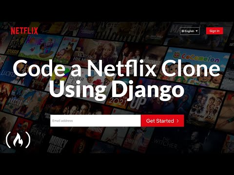
The digital landscape is a battlefield, and understanding how to construct resilient systems is paramount. Today, we're not just building a frontend; we're dissecting the architecture of user experience, mimicking a titan of streaming. This tutorial, adapted from OtchereDev's insightful work, transcends a simple coding exercise. It's a masterclass in crafting interactive interfaces, a practical application of modern web technologies that every aspiring developer must master. We'll dive deep into Django's backend capabilities and Tailwind CSS's utility-first approach to replicate the iconic Netflix interface.
Course Overview: Replicating the Netflix Experience
This guide is a comprehensive walkthrough, designed to equip you with the skills to replicate the frontend of a service like Netflix. We will simulate the user-facing aspects, focusing on the visual presentation and interactive elements that define a modern streaming platform. The objective is not merely to copy, but to understand the underlying principles of responsive design, component-based development, and efficient styling.
The Stack: Django and Tailwind CSS
Our toolkit for this endeavor consists of two powerful technologies:
**Django**: A high-level Python web framework that encourages rapid development and clean, pragmatic design. It handles the server-side logic, data management, and API endpoints necessary to power our frontend. Understanding Django is crucial for building robust web applications.
**Tailwind CSS**: A utility-first CSS framework that provides low-level utility classes to build completely custom designs directly in your markup. It streamlines the styling process, allowing for rapid prototyping and maintainable stylesheets without the overhead of traditional CSS frameworks.
The synergy between Django's backend power and Tailwind's frontend flexibility allows for efficient development of complex user interfaces.
Walkthrough: Simulating the Netflix Frontend
This section breaks down the process into actionable steps, mirroring a practical penetration test where each step reveals a new layer of the system.
Step 1: Project Setup and Environment Configuration
The first command issued in any operation is critical. We must establish a secure and isolated environment.
1. Create a new Django project:
```bash
django-admin startproject netflix_clone
cd netflix_clone
```
2. Create an app for the frontend components:
```bash
python manage.py startapp frontend
```
3. Install Tailwind CSS and its dependencies. This typically involves using a package manager like npm or yarn and configuring PostCSS.
```bash
npm install tailwindcss postcss autoprefixer
```
4. Configure `tailwind.config.js` to scan your Django templates for classes.
```javascript
// tailwind.config.js
module.exports = {
content: [
"./templates/**/*.html",
"./frontend/templates/**/*.html", // If you use app-specific templates
"./frontend/**/*.py", // For template tags/filters written in Python
],
theme: {
extend: {},
},
plugins: [],
}
```
5. Set up PostCSS to process your Tailwind CSS. This usually involves a `postcss.config.js` file.
Step 2: Designing the Core Layout and Navigation
A strong perimeter is key. We start with the foundational elements of the user interface – the header and navigation.
1. **Header Component**: This is the entry point. Replicate the Netflix header with its logo and navigation links.
Use Tailwind classes for responsiveness and styling (e.g., `flex`, `items-center`, `justify-between`, `bg-black`, `text-white`).
Consider absolute or fixed positioning for the header to ensure it stays visible.
2. **Navigation Menu**: Implement the primary navigation links (Home, TV Shows, Movies, etc.).
Styling these links with hover effects and active states is crucial for user feedback.
Ensure navigability across different screen sizes, possibly collapsing into a hamburger menu on smaller devices.
Step 3: Building the Hero Section
The hero section is the initial breach into the content. It needs to be visually arresting.
1. **Background Image/Video**: Implement a prominent background that captures the essence of featured content.
2. **Content Overlay**: Add titles, descriptions, and call-to-action buttons (e.g., "Play", "My List").
Use Tailwind's typography and spacing utilities to achieve a professional look.
Pay close attention to text readability against the background.
This is where the bulk of the content display logic resides. Each row represents a category of media.
1. **Row Structure**: Create a container for each row, typically with a heading (e.g., "Trending Now", "Originals").
2. **Carousel/Horizontal Scroll**: Implement a mechanism to display multiple movie/series cards horizontally. This often involves CSS for overflow properties and JavaScript for interactive carousels.
Tailwind's `overflow-x-auto` combined with `flex` can provide a basic scrollable experience.
3. **Movie/Series Cards**: Each card should display essential information:
Thumbnail image.
Title.
Potentially a rating or short description.
Use responsive design principles so cards adapt to different screen sizes.
Step 5: Integrating Interactivity and Modals
User engagement often requires dynamic elements.
1. **Hover Effects**: Implement subtle animations on cards when hovered over, revealing more information or a play button.
2. **Modal Popups**: When a user clicks on a card, a modal should appear displaying detailed information about the selected content.
This involves JavaScript to toggle the modal's visibility and populate it with data.
Styling the modal with Tailwind to ensure it overlays the content seamlessly.
Step 6: Responsive Design and Cross-Browser Compatibility
A true test of engineering is how the system performs under varying conditions.
1. **Mobile-First Approach**: Design with mobile devices in mind, then scale up.
2. **Tailwind's Breakpoints**: Utilize Tailwind's predefined breakpoints (`sm:`, `md:`, `lg:`, `xl:`) to adapt layout and styling.
3. **Thorough Testing**: Test the clone across different browsers and devices to ensure a consistent experience.
Veredicto del Ingeniero: ¿Vale la pena adoptarlo?
Building a Netflix clone with Django and Tailwind CSS is an exceptional exercise for understanding modern frontend development. Django provides a robust backend framework, while Tailwind CSS offers an incredibly efficient and flexible way to style complex interfaces without fighting against pre-defined component structures.
**Pros:**
**Rapid Development**: Tailwind CSS significantly speeds up the styling process.
**Maintainability**: Utility classes lead to cleaner, more predictable CSS.
**Modern Skillset**: Proficiency in Django and Tailwind is highly valuable in the job market.
**Conceptual Understanding**: Replicating a complex UI like Netflix solidifies understanding of layout, responsiveness, and user interaction.
**Cons:**
**Learning Curve for Tailwind**: While fast, mastering the utility-first paradigm requires a shift in thinking.
**Django Backend Complexity**: For a pure frontend simulation, Django might be overkill, but it's invaluable for learning full-stack capabilities.
**Markup Bloat**: Heavy reliance on utility classes can sometimes lead to verbose HTML.
**Recommendation**: Absolutely worth the effort. This project is not just about building a clone; it's about mastering the tools and techniques that power the modern web. It’s an ideal project for anyone looking to enhance their skills in both backend and frontend development within the Python ecosystem.
Arsenal del Operador/Analista
To effectively execute and analyze projects of this nature, a well-equipped toolkit is essential.
**Code Editor**: Visual Studio Code (VS Code) with extensions for Python, Django, and Tailwind CSS.
**Version Control**: Git and GitHub/GitLab for collaboration and code management.
**Browser Developer Tools**: Essential for inspecting elements, debugging CSS, and testing responsiveness.
**Package Managers**: npm or Yarn for managing frontend dependencies.
**Python Environment Manager**: virtualenv or Poetry for isolating project dependencies.
**Documentation**: Official Django and Tailwind CSS documentation are your primary intelligence sources.
**Inspiration**: Netflix’s actual website for reference and analysis.
Taller Práctico: Responsive Navigation Bar with Tailwind CSS
Let's implement a foundational responsive navigation bar.
Create a base template: In your Django `templates` directory, create `base.html`.
Link Tailwind CSS: Ensure Tailwind CSS is correctly compiled and linked in your `base.html`. This might involve pointing to a compiled CSS file generated by your build process.
Structure the header: Use semantic HTML elements like ``, `
Frequently Asked Questions
What is the primary purpose of simulating a Netflix clone?
The primary goal is to practice and demonstrate skills in building complex, interactive, and responsive user interfaces using modern web technologies like Django and Tailwind CSS. It serves as a practical application of frontend development principles.
Is it necessary to use a backend framework like Django for a frontend simulation?
While you could use a static site generator or a frontend-only framework, using Django allows for a more complete full-stack learning experience, understanding how data is served and managed. For this specific tutorial, it provides structure and context.
How does Tailwind CSS differ from other CSS frameworks like Bootstrap?
Tailwind is a utility-first framework, meaning it provides low-level utility classes that you compose directly in your HTML to build custom designs. Frameworks like Bootstrap often provide pre-built components (buttons, cards) that you customize, which can be faster initially but less flexible long-term.
What are the key challenges when building a UI like Netflix?
Key challenges include managing large amounts of content, implementing smooth horizontal scrolling or carousels, ensuring consistent responsiveness across devices, and optimizing performance for faster loading times.
"The only constant in the technology industry is change." - Always be learning, always be building.
El Contrato: Your First Successful Deployment
Your mission, should you choose to accept it, is to take the provided code snippet for the responsive navigation bar and integrate it into a basic Django project. Ensure that Tailwind CSS is correctly configured and that the navigation bar displays correctly on both desktop and mobile views. Document any configuration challenges you encounter and the solutions you implement. The ability to set up and deploy a functional component is the first byte in the chain of command.